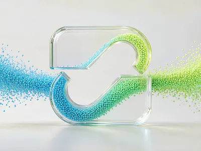
The same symbol can suggest very different things when its surface and lighting change. A translucent treatment may feel light and experimental; a polished metal finish may feel precise and ceremonial. Neither effect is automatically better. The useful question is whether the finish supports the personality, audience, and setting of the brand. A 3D Logo Maker makes it practical to view several interpretations of one idea, but a style menu is only the beginning of the decision. Teams still need to compare legibility, visual weight, and the places where the logo will appear. A disciplined style test turns a collection of attractive images into a clear recommendation that a founder, designer, and marketer can discuss together.
Translate Brand Language Into Visible Criteria
Before using a 3D Logo Maker, start with three adjectives that already describe the brand. Then translate each one into an observable design property. “Approachable” might mean soft edges, generous space, and gentle contrast. “Precise” might mean a controlled silhouette and fewer competing highlights. These translations keep a 3D Logo Maker session tied to the brand rather than the novelty of a particular effect.
Add two constraints to the 3D Logo Maker brief before generating. One should address recognition: the mark must still be identifiable without its surface detail. The other should address use: the result needs to hold up at the size or placement that matters most. A logo intended for an app icon faces different pressure than a graphic used mostly in launch presentations. When reviewers agree on these constraints first, their later comments become easier to compare.
Hold the underlying idea steady
Use the same uploaded logo or the same written symbol description across the first style tests. If the subject changes along with the finish, the team cannot tell which variable caused a stronger reaction. Write a brief that specifies the symbol, name if needed, and essential colors. Then change only the selected style. A 3D Logo Maker can help produce that controlled set of alternatives from a single starting idea.
Read Each Style as a Design Choice
In a 3D Logo Maker comparison, Glassmorphism uses a translucent, frosted look and soft light. It can suit a digital product that wants a light, contemporary feel. Watch for pale details vanishing against bright backgrounds. Gradient Volumetric relies on rounded form and broad color transitions. It can add warmth and volume, but the team should check that the main shape does not become so soft that it loses its distinct outline.
Pseudo-3D suggests depth with geometric planes and flat shading. It can make a mark feel structured and diagrammatic, which may work for a technical or architectural identity. A 3D Mascot direction builds an expressive character from the brand idea. It can be memorable when character is central to the identity, yet may be a poor fit when the audience expects a restrained mark. Metallic introduces reflective surfaces and dramatic light, often creating a formal or premium impression. It needs careful testing because reflections can compete with the underlying symbol.
For a 3D Logo Maker review, these descriptions are starting hypotheses, not fixed industry rules. A playful brand can use metal with humor; a serious brand can use a soft gradient with confidence. The 3D Logo Maker offers Glassmorphism, Gradient Volumetric, Pseudo-3D, 3D Mascot, and Metallic as directions to explore. The right comparison asks what each treatment changes about the same mark and whether that change serves the brief.
Look beyond the style label
Inspect the size of highlights, the direction of light, the darkness of shadows, and the amount of empty space around the symbol. Two images within one named style may communicate different moods because these details vary. When a 3D Logo Maker produces a promising result, record the actual visible traits you want to keep. “Soft top-left light and restrained shadow” is a more useful handoff than “make it glass.”
Compare at the Sizes People Will See
Build a simple 3D Logo Maker contact sheet with the original idea and three style candidates. Give each candidate the same white space and display size. First judge the silhouette in grayscale. Then restore color and view the images at the size of a social avatar and a website header. This reveals whether depth supports recognition or merely adds decoration. A 3D Logo Maker result that reads beautifully at presentation size might become a vague shape in a small profile circle.
Ask reviewers to score only a few factors: recognizable shape, readable name, match to the brand adjectives, and suitability for the primary placement. The scores are not scientific measurements. They are prompts for an informed discussion. If the highest-scoring candidate has a misspelled wordmark or a distorted symbol, reject it and generate again. A pleasing finish does not excuse a broken identity cue.
When the original concept is still unsettled, explore its basic mark before spending time on surface treatments. An AI Logo Generator can help a team sketch an initial logo idea from a written brief. Once the symbol is reasonably clear, a 3D Logo Maker test can compare how different dimensional looks affect it. This sequence keeps concept development and style selection from being mistaken for the same task.
Make the Selection Useful for Future Work
Choose one preferred 3D Logo Maker direction and one fallback, then write a short rationale. Note where the chosen image works, where it does not, and which visual traits should survive a later refinement. A practical recommendation may be “use the rounded gradient treatment for campaign imagery, but retain a simpler primary mark at small sizes.” That is clearer than declaring one style the permanent winner.
The generated result is a 3D-style logo image rather than a rotatable 3D object. Review the available image format and the needs of the next placement before handoff. A 3D Logo Maker can accelerate visual exploration, while the final brand system still benefits from deliberate choices about consistency, scale, and accessibility. The best style is the one that makes the underlying mark easier to recognize and the brand easier to understand in its actual context.